Week 95: 1/3 - 1/9
- Jan 10, 2022
- 4 min read
The Covid-19 Hospitalization situation continues to worsen: Covid-19 Patient Numbers are doubling in less than 10 days, a reduction from Week 94. Cases are extremely high (everyone has seen the testing center lines) ; DSHS Case Notes state that their data contains backlogged results from previous weeks along with a high number of positives with no address; therefore, they are not assigned to any county and are simply added to Texas's total. Vaccination Rates are less than .5% changed from Week 94.
Covid-19 Hospitalizations
Figure 1 illustrates how Covid-19 Hospitalization numbers continue to rise. On a per-capita basis, the Panhandle wins the prize for 40 Covid-19 patients per 100,000 population. This is on par with the States of Nevada and Rhode Island. The Gulf Coast and North Texas are not far behind with 33 and 31 respectively. These compare with South Dakota and Alabama.
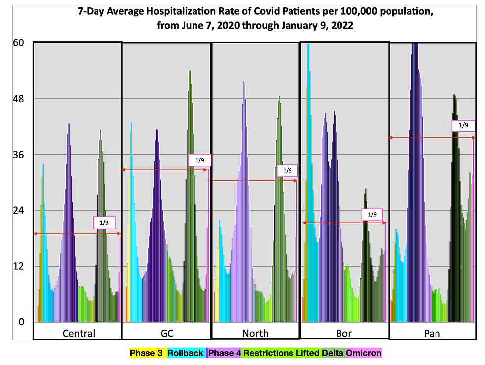
Figure 2 tabulates the increases represented by these results; these include TSA doubling rates between 5 days (Laredo) and 12 (Corpus Christi). Texas's Overall State Numbers come to 9 which is 2 days less than it was during Week 94. Half of the TSA's have doubling rates less than 10 days.
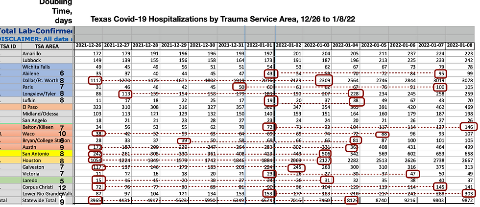
With a large growth in the Covid-19 Hospitalization, the ICU capacity is at risk. Abilene (46% Hospital beds with Covid-19 patients), El Paso (25%), and Laredo (18%) have one or less ICU beds open.
Across the Houston area, Hospitals report that unvaccinated individuals are using 70+% of ICU beds. https://www.houstonchronicle.com/news/houston-texas/health/article/Omicron-is-sending-vaccinated-people-to-the-16755204.php. The article supports Washington Post reports that the Covid-19 Patient surge comes from people that are in the hospital for other reasons and just happen to also test positive as well https://www.washingtonpost.com/health/2022/01/06/covid-hospitals-how-is-omicron-different/.
The New Case numbers are so high that the state's testing capacity is reaching/has reached its limit. Test results lag such that the data reported requires a series of backlogged updates to characterize the total number of positives for a given date and county. So, there is little point in me reporting them here when they will be updated per backlogging new backlogging procedures over the next 2-3 weeks. To make this problem worse, Texas DSHS reports that just over 18,000 test results do not have complete addresses at the end of Week 95. This means that, while these are included in the State's totals - they have not been assigned to any county or TSA for % positive calculation or other assessment. Finally, individuals have begun testing themselves using over-the-counter kits. These results are also not included in a TSA or county % positive calculation. The the answer to the question: when will we peak is moot?: because of such data issues, we will only see the peak after we have passed it.
What's You're Color? With such a striking reversal of trends, officials have their work cut out for them convincing the public to go back to distancing, masking, and reducing interactions with others. Indoor events with large audiences have been canceled and businesses are struggling to keep their operations going given a large absentee rate, Universities and schools have retreated online. One after another, cities and counties across the state have used color-coded "threat" or "alert" level signals to provide guidance in helping their citizens make such decisions.
Figure 3 is a graphic of Texas's Major City Dashboard. These Covid-19 "Threat" or "Alert" Levels are designed to signal, at a glance, whether the Covid-19 situation is "Minimal/Low Community Risk for Transmission/Low (Blue or Green) or Severe/High Community Risk for Transmission/Critical/Extreme (Red or Black). They can also connect the alert with the behavior protocols. Here, city residents and visitors (e.g.
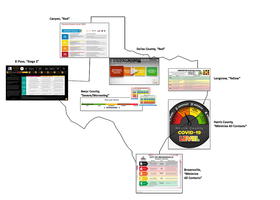
commuters and travelers) can find out whether they can Resume Normal Activities/New Normal Until You're Vaccinated (?) or Restrict Movement/Stay Home/Wear face masks Finally, a column of criteria gives officials and the public information that explains how data trends relate to the required action.
I have found several problems with these charts: When pulling one up, you are never sure that you have the latest version; without a date or way of finding out when the change was made and/or if it has expired. What if you live in a place like my city, Friendswood, that straddles two counties? Do you follow Galveston County or Harris County protocols? Wouldn't it be nice if there was a way to aggregate these; for example, travelers who are driving across the state?
I want to end with a series of Tweets from Dr. Peter Hotez. He speculates about our future and, with the Federal Administration looking to a more long-term strategy, such comments are helpful (For links to the reference articles, proceed to the "Read This!" part of this website. https://www.texascovid19trail.com/post/links-and-abstracts


Credit goes to Lisa Gray from City Cast Houston for bringing these to my attention, 1/7/22.
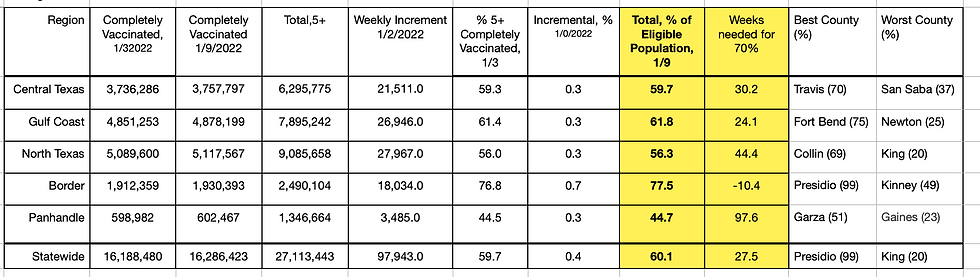
Vaccination Rates: No change here, really. We are six months to one year from reaching a point at which the numbers of vaccinated far outnumber the unvaccinated. I am not sure that Texas as a whole can get there, but certainly we should celebrate Presidio County who is less than 100 people in their 5+ population from reaching a 100% coverage.


Comments